Style Guide

This Style Guide documents all core visual styles and variables used in the Waveyu template. Use this page to review and update the design system so the site stays visually consistent.

Colors & Border

(Variables)

Color – Base

Color / Black
33, 33, 33, 1
Action and high-emphasis text color.
Color / White
255, 255, 255, 1
Color for text and icons placed on images or dark areas, and for light surfaces like cards.
Color / Accent
206, 226, 83, 1
Accent color for decorative highlights and hover states.
Color / Accent Dark
189, 215, 37, 1
Darker accent color used on hover when the base element already uses Accent.

Color – Surface

Color / Bg Page
247, 247, 247, 1
Base surface color for page sections and inner cards.
Color / Bg Subtle
234, 234, 234, 1
Subtle surface color for secondary containers and icon wrappers.
Color / Bg Green
15, 41, 22, 1
Green surface color for backgrounds.
Color / Bg Frost
255, 255, 255, 0.3
Muted white color used as background for badges and buttons on images (with backdrop blur), and for decorative elements on dark backgrounds.

Color – Text

Color / Text Muted
112, 112, 112, 1
Default neutral color for body and secondary text on light backgrounds.
Color / Heading Accent
141, 141, 141, 1

Color for emphasizing selected words inside headings.

Color / Text Frost
255, 255, 255, 0.3
Muted white text color for secondary text on dark backgrounds.

Border  – Color, Size

Color / Border Subtle
33, 33, 33, 0.2
Neutral color for structural dividers and borders.
Size / Radius Outer
1.875 rem
Size / Radius Inner
1.375 rem

Typography

All H1 Headings

H1 Heading

Page heading.
All H2 Headings

H2 Heading

Section heading.
All H3 Headings

H3 Heading

Subsection heading.
All H4 Headings

H4 Heading

Supporting heading.
All H5 Headings
H5 Heading
Detail heading.
All H6 Headings
H6 Heading
Smallest heading.
All Paragraphs

Paragraph

Body text.
All Unordered Lists
  • text-block
  • text-block
  • text-block
All Ordered Lists
  1. text-block
  2. text-block
  3. text-block
All Block Quotes
Block Quote
Direct quote or testimonial.
Body (All Pages)
text-block
Default text settings.

Rich Text

Three people relaxing by a pool surrounded by lush greenery and tropical plants, with a wooden villa in the background.
Figure Caption Example

Heading H1

Heading H2

Heading 3

Heading 4

Heading 5
Heading 6

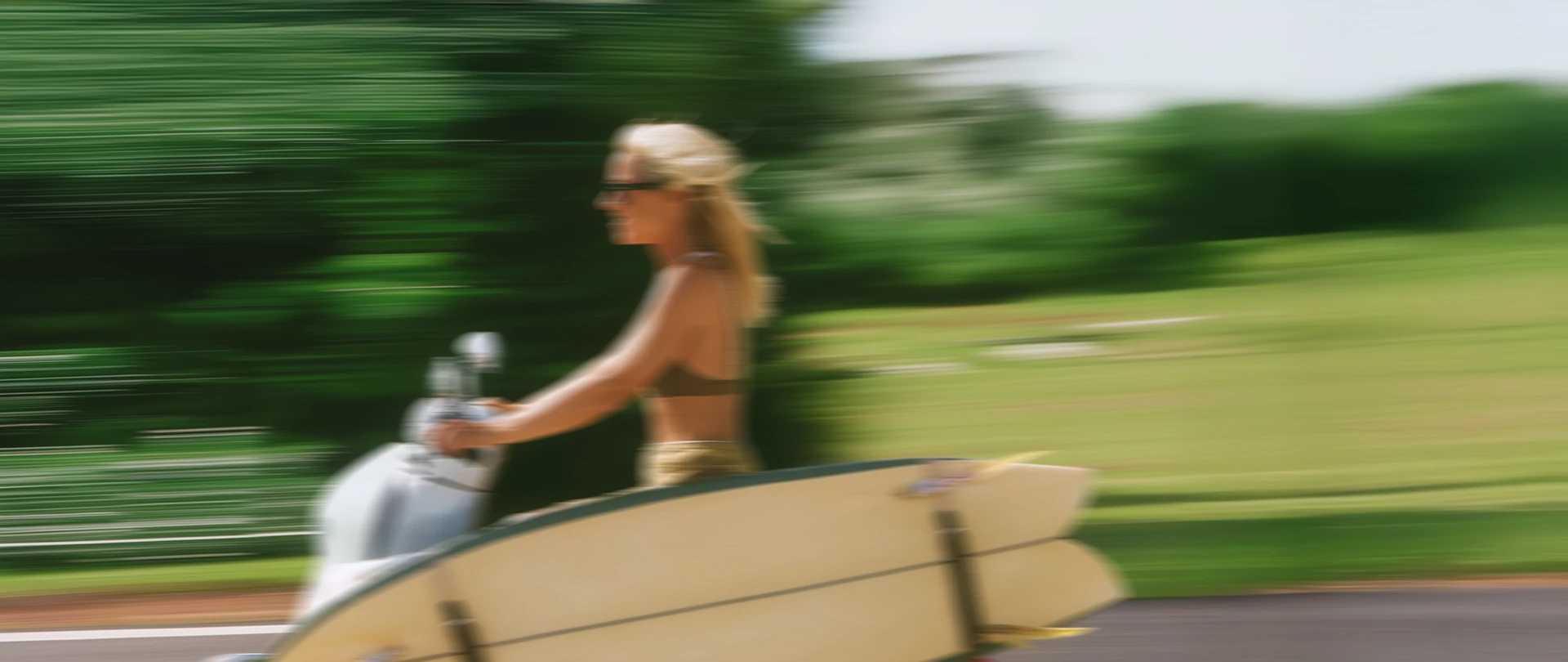
Waveyu Surf Camp sits on the golden shores of Canggu, Bali — a place where the ocean sets the rhythm for every single day. Whether you are catching your very first wave or perfecting your cutback, our experienced local coaches will guide you through sessions tailored to your level. Between surfs, unwind in our tropical garden, join a sunset yoga class, or explore the vibrant neighborhood on a vintage scooter.

Block quote

Ordered list

  1. Item 1
  2. Item 2
  3. Item 3

Unordered list

  • Item A
  • Item B
  • Item C

Text link

Bold text

Emphasis

Superscript

Subscript

Text Style Utilities

Text Size

u-text-size-small
Small text size for subtle supporting details (dates, captions, author names, copyright).
u-text-size-large
Large text size for prominent stats and headline-style titles.
u-heading-h3-small

Smaller visual style for h3, used when a more compact h3 is needed without changing heading hierarchy.

Text Color

u-text-color-muted
Muted color for body and secondary content on light backgrounds.
u-text-color-white
White color for main content on dark backgrounds.
u-text-color-frost
Muted white color for secondary content on dark backgrounds.

Components

Buttons & Items

Primary Button Popup
Used for opening a contact form popup on click. Has a built‑in trigger action.
Primary Button Link
Used as a regular button link to pages, anchors, or external URLs. No trigger action.
Timetable Item
Used to show the time slot and activity in the timetable.
07:00-08:00
Activity

Navbar

CTA Banner

Ready?

Your spot is waiting!
Come join us!

Apply Now

Footer

Layout & Position Utilities

u-flex-row
Example
Example
u-absolute-bottom-right
Example
Example
u-absolute-top-right
Group of friends standing on rocks in front of a tall tropical waterfall.
u-absolute-full

Layouts

layout-split
Horizontal section layout that places content blocks side by side on desktop and stacks them vertically on smaller screens.
Example
Example
layout-stack
Vertical stack layout that arranges section content in a single column
Example
Example
layout-grid
Base grid layout for manually arranging content blocks in two or more columns.
Example
Example
layout-cards
Cards grid layout used to display multiple cards in a responsive multi-column grid.
Example
Example
layout-centered
Centered section layout that vertically and horizontally centers content in a single column.
Modifiers:
layout-centered
is-hero
Sets full viewport height for hero sections (min-height: 100vh; position: static).
layout-centered
is-cta
Creates a fixed-height CTA panel (min-height: 35rem, position: relative).
Example

Join Surf Camp
In Bali

Apply Now
layout-popup
Responsive popup layout for modal content with rounded white panel on desktop and full-height stacked layout on mobile.
EXAMPLE

Join the camp

Thank you! Your submission has been received!
Oops! Something went wrong while submitting the form.

Spacing & Height System

Padding (Responsive)

Padding Section / Horizontal
Sets horizontal padding for all sections.
1440px+
4rem
Base Mode
2rem
Tablet
2rem
Landscape
1.5rem
Mobile
1.5rem
Padding Section / Vertical
Sets consistent vertical padding for all sections.
1440px+
3rem
Base Mode
3rem
Tablet
3rem
Landscape
3rem
Mobile
3rem
Padding Popup / Popup Horizontal
Sets horizontal padding for popups.
1440px+
2rem
Base Mode
2rem
Tablet
2rem
Landscape
1.5rem
Mobile
0rem
Padding Popup / Popup Vertical
Sets vertical padding for popups.
1440px+
3rem
Base Mode
3rem
Tablet
3rem
Landscape
3rem
Mobile
0rem

Height (Responsive)

Interactive Media Height
Sets responsive height values for sliders that contain popup content, with increased height on smaller screens to fit longer text.
Base Mode
35rem
Tablet
30rem
Landscape
20rem
Mobile
35rem
Static Media Height
Sets responsive height values for images and simple sliders without popup content, with slightly smaller height on mobile for more compact layouts.
Base Mode
35rem
Tablet
30rem
Landscape
20rem
Mobile
30rem

Gap (Static & Responsive)

Static
Gap
Sets consistent gap between elements.
XS
0.5rem
S
1rem
M
1.5rem
L
2rem
XL
4rem
Responsive
Gap / XS to M
Sets narrow gap on large screens, standard on small; use for card grids.
1440px+
0.5rem
Base Mode
0.5rem
Tablet
0.5rem
Landscape
1.5rem
Mobile
1.5rem
Responsive
Gap / L to M
Sets wide gap on large screens, standard on small; use for row gaps in main layouts and for spacing in nested content areas.
1440px+
2rem
Base Mode
2rem
Tablet
2rem
Landscape
1.5rem
Mobile
1.5rem
Responsive
Gap / XL to M
Sets extra wide gap on large screens, standard on small; use for column gaps in main layouts.
1440px+
4rem
Base Mode
4rem
Tablet
2rem
Landscape
1.5rem
Mobile
1.5rem